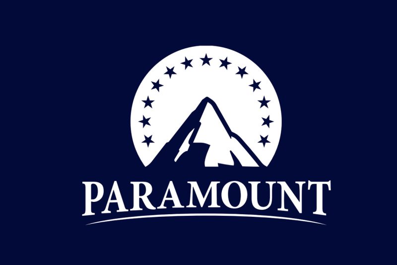
The recent unveiling of the new Paramount logo has become a hot topic of discussion among fans and critics alike. With its departure from the iconic mountaintop design that has been synonymous with the studio for decades, the new logo has raised eyebrows and sparked debate within the entertainment industry.
One of the primary concerns expressed by fans is the departure from tradition. The classic Paramount logo, featuring a majestic mountain peak surrounded by a starry night sky, was a symbol of the studio’s longstanding legacy and commitment to quality entertainment. The new logo, in contrast, features a simple blue P with a swirling tail, lacking the grandeur and elegance of its predecessor.
Many fans have expressed disappointment at the lack of creativity and originality in the new design. The old Paramount logo had a timeless quality that resonated with audiences across generations, capturing the imagination and setting the stage for countless blockbuster films. In comparison, the new logo feels generic and uninspired, failing to leave a lasting impression or evoke a sense of awe.
Critics have also pointed out the missed opportunity for innovation in the new logo. In an industry that thrives on innovation and creativity, the decision to overhaul a beloved symbol without offering a fresh and exciting alternative has been met with skepticism. Instead of pushing boundaries and redefining the studio’s visual identity, the new logo feels like a step backward, playing it safe rather than embracing change.
The choice of color and design elements in the new logo has also been a point of contention. The use of a single shade of blue, while sleek and modern, lacks the depth and dimension of the multi-colored mountaintop logo. Some fans have even compared the new logo to a corporate brand identity, suggesting that it fails to capture the magic and allure of the entertainment industry.
Despite these criticisms, some supporters of the new logo have defended it as a necessary evolution for Paramount in the digital age. With the rise of streaming platforms and online content consumption, studios are under pressure to adapt their branding strategies to appeal to a new generation of viewers. The new logo, with its minimalist design and digital-friendly aesthetic, may be seen as a strategic move to stay relevant in a rapidly changing landscape.
In conclusion, the unveiling of the new Paramount logo has sparked a passionate debate among fans and critics alike. While some see it as a missed opportunity for innovation and a departure from tradition, others view it as a necessary evolution for the studio in the modern era. Only time will tell whether the new logo will stand the test of time or be replaced by a design that better captures the spirit of Paramount’s legendary legacy.

