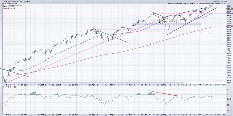
Unlock Your Investing Potential: 3 Creative Ways to Picture the Beginning of a Distribution Phase
Visualizing the start of a potential distribution phase is crucial for traders and investors to make informed decisions in the stock market. By understanding key visual cues and patterns, individuals can gain insights into the behavior of market participants and identify potential turning points. Here are three effective ways to visualize the beginning of a distribution phase:
1. Volume Analysis:
Volume analysis is a powerful tool in technical analysis that can provide valuable information about market sentiment and strength. In the context of visualizing a distribution phase, monitoring changes in trading volume can offer significant clues. During the initial stages of distribution, there is often a noticeable divergence between price movements and trading volume. As the price of an asset begins to plateau or show signs of weakness, a decrease in trading volume may indicate waning interest from buyers and accumulation by smart money or institutional investors.
By utilizing volume indicators such as the Volume Weighted Average Price (VWAP) or On-Balance Volume (OBV), traders can identify anomalies between price action and volume trends that may signal the start of a distribution phase. Additionally, volume analysis can help confirm the validity of potential distribution patterns, such as head and shoulders formations or topping patterns, by looking for supporting volume patterns.
2. Price Chart Patterns:
Chart patterns are visual representations of historical price movements that can help traders anticipate future price actions. When visualizing the start of a distribution phase, traders should pay close attention to specific chart patterns that suggest a shift from accumulation to distribution. Common distribution patterns include double tops, triple tops, head and shoulders, and rising wedges.
By identifying these patterns on price charts and analyzing key support and resistance levels, traders can anticipate potential reversal points and adjust their trading strategies accordingly. Combining price chart patterns with other technical indicators, such as moving averages or Relative Strength Index (RSI), can enhance the accuracy of identifying the beginning of a distribution phase.
3. Market Breadth Indicators:
Market breadth indicators measure the overall health and direction of the market by analyzing the number of advancing and declining stocks. These indicators provide a broader view of market participation and can help traders assess the underlying strength of a potential distribution phase. As smart money begins to distribute their holdings, market breadth indicators may show a deterioration in the number of stocks advancing compared to those declining.
One popular market breadth indicator is the Advance-Decline Line (ADL), which tracks the cumulative difference between advancing and declining stocks over time. A divergence between the ADL and market prices can signal a divergence in market breadth and point to the initiation of a distribution phase. Additionally, monitoring sector rotation and tracking the performance of key market indices can provide valuable insights into the shifting market dynamics during a distribution phase.
In conclusion, visualizing the start of a potential distribution phase requires a combination of volume analysis, price chart patterns, and market breadth indicators. By leveraging these visual cues and patterns, traders can enhance their decision-making process and adapt their trading strategies to changing market conditions. Stay vigilant, keep an eye on key visual indicators, and remain proactive in identifying potential distribution phases to stay ahead of the market trends.
